Digital Marketing Reporting with Looker Studio
Why It Matters
Most marketing teams drown in data but starve for insight. Static spreadsheets lag behind what’s actually happening. A smart reporting system built with GTM, GA4, BigQuery, and Looker Studio, turns your metrics into weekly momentum.
The Usual Problems
- Data silos: Analytics, ecommerce, and CRM never line up.
- Slow refreshes: By the time reports update, opportunities are gone.
- Manual tinkering: Endless dashboard edits waste time better spent optimizing campaigns.
The Fix
1. Centralize Data in GTM
Use one GTM container across all properties.
Tag key actions like purchase, form_submit, and add_to_cart.
→ One clean data layer = reliable, scalable tracking.
2. Feed It Into One Hub
Send GTM events to GA4 or BigQuery through the Measurement Protocol.
Pull ecommerce data from Shopify or WooCommerce APIs.
→ One source of truth for all reporting.
3. Build Dashboards That Drive Action
Dashboards shouldn’t just look good, they should speak your business’s language. Build them around the KPIs that actually drive profitability and decision-making. Here’s your quick-reference glossary to get started:
ROAS (Return on Ad Spend)
Revenue ÷ Ad Spend
Measures how much revenue each ad dollar generates.
→ Act when: ROAS dips below your break-even threshold. Reallocate spend toward high-performing campaigns or audiences.
ACOS (Advertising Cost of Sale)
Ad Spend ÷ Revenue: the inverse of ROAS, common in ecommerce and marketplaces.
→ Act when: ACOS rises; refine targeting or improve conversion rate to reduce wasted spend.
ROI (Return on Investment)
(Profit – Cost) ÷ Cost
Goes beyond ad performance to measure full marketing efficiency.
→ Act when: ROI falls short of internal benchmarks, evaluate your overall channel mix or customer acquisition strategy.
CPA (Cost per Acquisition)
Total Spend ÷ Number of Conversions
Shows what it costs to win a customer or lead.
→ Act when: CPA climbs higher than target value; test new creatives, improve landing pages, or adjust bidding.
CTR (Click-Through Rate)
Clicks ÷ Impressions
Reveals ad relevance and engagement quality.
→ Act when: CTR declines; refresh ad copy, imagery, or audience targeting.
Conversion Rate (CVR)
Conversions ÷ Sessions or Clicks
Indicates how effectively you turn interest into action.
→ Act when: CVR drops review page load speed, checkout friction, or mobile UX.
Customer Lifetime Value (LTV)
Average Order Value × Purchase Frequency × Retention Duration
Predicts total revenue from a customer over time.
→ Act when: LTV shrinks; focus on retention campaigns and personalized offers.
Churn Rate
Lost Customers ÷ Total Customers
Tracks how well you’re retaining users.
→ Act when: Churn spikes, improve post-purchase experience or loyalty touchpoints.
4. Turn Reports Into Real Decisions
A dashboard is only useful if it changes what you do next. The goal isn’t to admire data it’s to act on it.
Use your weekly report to identify what’s moving the needle: which campaigns drive profitable traffic, and which are burning budget.
Adjust bids, budgets, or creative direction based on performance deltas, not hunches.
Revisit audience targeting and ad frequency when engagement drops below your benchmarks.
Add annotations or quick notes directly in Looker Studio so context is captured with every trend.
→ The smartest marketers don’t just collect data, they close the loop between insight and action, week after week.
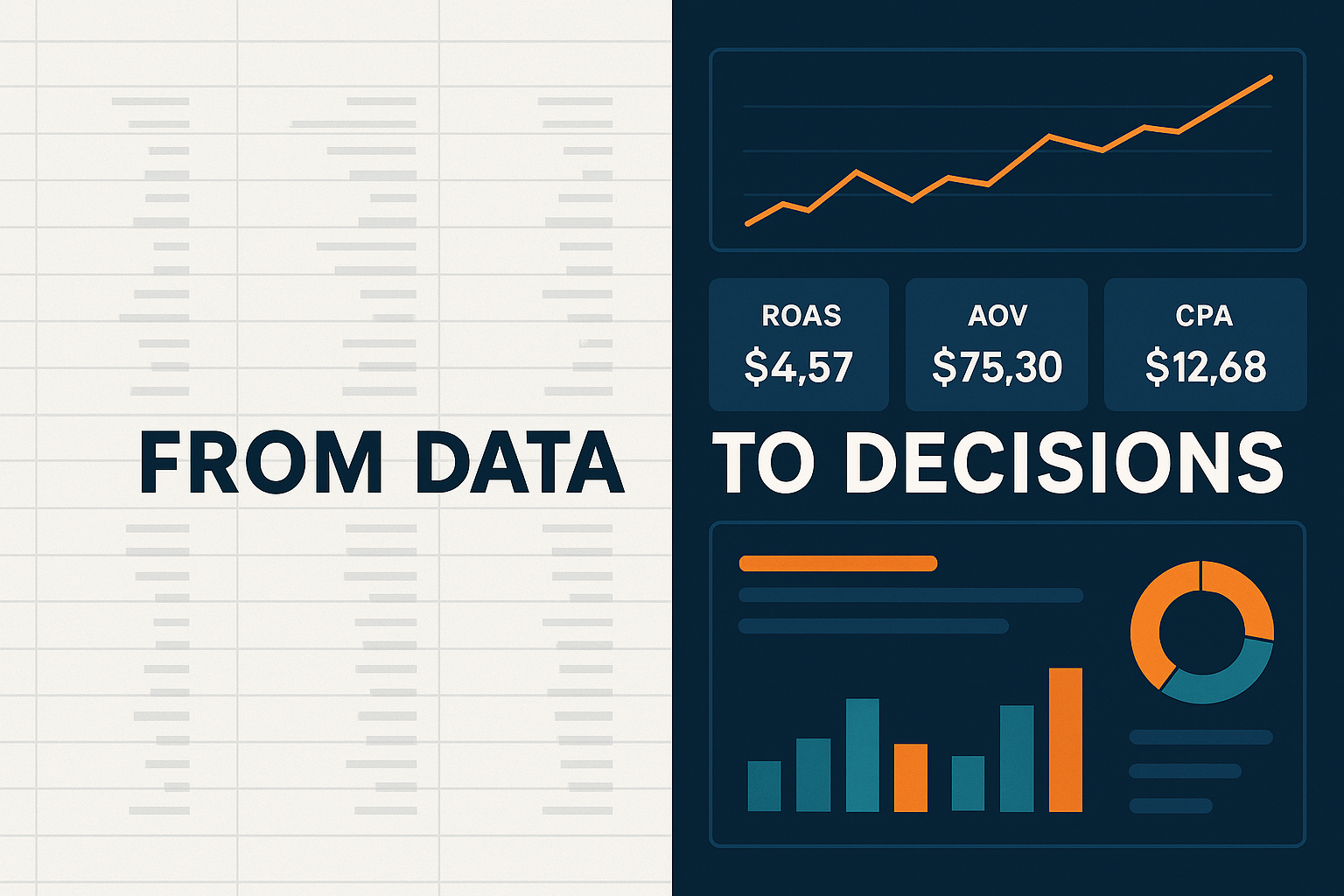
Quick Win Example
A mid-size ecommerce brand built their weekly dashboard around ROAS, AOV, and CPA. Using GTM, they added add_to_cart and checkout_start events to capture real buying intent, not just traffic.
Within a week, Looker Studio revealed a 15 % drop in mobile AOV and a corresponding rise in CPA. Instead of guessing, the team traced the issue to a new checkout step implemented on mobile. They streamlined the UX, restored AOV, and boosted overall ROAS by 30% within two weeks.
Lesson: When your dashboard tracks meaningful KPIs, it doesn’t just report what happened, it shows you exactly where to act.
Common Pitfalls
🚫 Ignoring data quality
🚫 Hardcoding constants in dashboards
🚫 Overstuffing metrics
🚫 Skipping documentation
Takeaway
Centralize, automate, and act.
A clean GTM setup, unified data warehouse, and purposeful dashboards transform reporting from routine to actions and improved performance.


